


Harry Beck
Four Victoria Line Sketches, 1961 - 1964
5 ½ x 7 in (each)
14 x 18 cm (each)
14 x 18 cm (each)
LDN6951
Further images
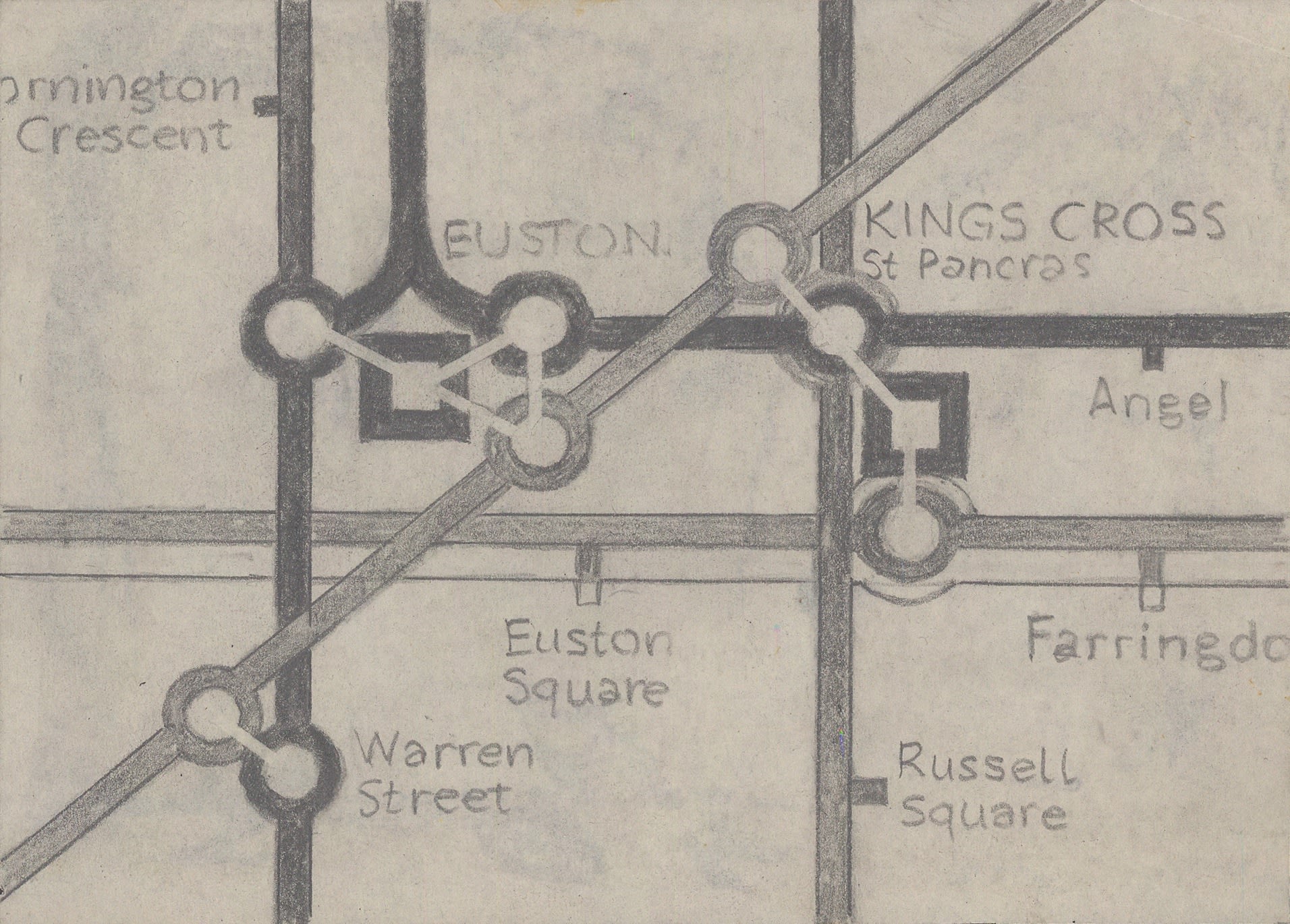
Four unique sketches in Harry Beck's own hand showing four different ways to depict the complex interchanges at Kings Cross & Euston Stations. These sketches were drawn between 1961 and...
Four unique sketches in Harry Beck's own hand showing four different ways to depict the complex interchanges at Kings Cross & Euston Stations. These sketches were drawn between 1961 and 1964 after Beck was unceremoniously ousted as the designer of the Underground map and replaced by Harold Hutchison. They show Harry Beck grappling with the complicated addition of the Victoria Line to his diagram, particularly in the busy area surrounding King's Cross and Euston Stations. It is clear from sketches like these that Beck clearly felt his work for London Transport would eventually continue and that he would be asked to resume control of the map if he could just show the Publicity Department that his solutions were far more elegant than anything Harold Hutchison had devised.
The first sketch (top-left) employs a design element which Harry Beck had never before used, but which did appear on the 1960 Hutchison design: a square symbol representing an interchange with a mainline train station. As Beck had never included this device on any of his previous or later maps, we can suppose that he did not like this solution, but offered it as an olive branch to the Publicity Department in hopes of winning back their support. Both King's Cross and Euston are busy with each having four symbols (three circles and a square) to represent the intersecting lines. This is the most congested of any of the Beck sketches, and likely his least favourite as a result.
The second sketch (top-right) uses a bend in the Circle & Metropolitan Lines at King's Cross to allow for a tidier connection with the Victoria Line. This 'hump' reduces the number of interchange circles to two, allowing for a much tighter diagram. Beck also continues the use of capitalized station names to indicate an interchange with British Railways services instead of Hutchison's square symbol. Beck had never been permitted to mix upper-case and lower-case station names prior to 1960, though it was a luxury he clearly enjoyed. Harold Hutchison's 1960 poster was the first to use upper-case station names for interchange stations, so Beck followed suit. Both of these changes would appear on the final poster he submitted to London Transport in 1964, so this was ultimately his preferred layout.
The third sketch (bottom-left) shows the layout proposed on Beck's 1961 poster submission. King's Cross has four interchange circles (one for each line) and Euston has three. Beck's use of coloured circles (including half circles with two colours) to indicate which lines intersect dated back to the first map of 1933, but this tradition had been axed by Hutchison who favoured the use of one black circle or square to indicate an interchange. This sketch includes one other design element which is unique to the 1961 poster - the curved line connecting the two branches of the northern line between Mornington Crescent and Euston. On Beck's 1961 poster, this feature is more angular and defined, whereas the simple connection between two parallel lines included on this sketch is simple, elegant, and tidy.
The fourth and final sketch (bottom-right) is the outlier in this series as it shows a slightly wider area, including much of the eastern half of the Circle Line, and parts of the Central and Piccadilly Lines. This is Harry Beck grappling with two problems simultaneously: the route of the Victoria Line and how it might affect the difficult eastern curve of the Circle Line. This sketch proposes a solution which never appears on any finished map, but was clearly inspired by Paul Garbutt's bottle shape for the Circle Line. Beck employs a similar shape, but reduces the neck of the bottle substantially. Instead of using Liverpool Street as the top of the bottle as both he and Garbutt had previously suggested, Beck places Aldgate East at the tip of the bottle. Only Liverpool Street, Aldgate East, Tower Hill, and Monument would form the neck of the bottle, removing Aldgate and Moorgate. Farringdon, Aldersgate (Barbican), and Moorgate now sit on an elegant diagonal line running southwest from King's Cross, whilst Aldgate and the Tower Hill Circle Line station sit on a straight vertical line which crosses the neck of the bottle. The King's Cross hump still appears, but it is enlarged and made of softer angles, blending it into the design. The interchange at King's Cross features four white circles, arranged in a clever 'Y' shape, another design never employed on a finished map.
This remarkable set of sketches show the evolution of Harry Beck's thinking about the addition of the Victoria Line and his ceaseless efforts to regain control of the design of the Underground map after 1960. Hardly any Beck sketches survive outside of the London Transport Museum's collection, let alone a series of four complementary drawings, making this a unique opportunity for collectors of Underground material, London maps, or 20th century design icons.
Provenance: Ken Garland's personal collection given to him by Harry Beck.
[LDN6951]
Join our mailing list
* denotes required fields
We will process the personal data you have supplied to communicate with you in accordance with our Privacy Policy. You can unsubscribe or change your preferences at any time by clicking the link in our emails.
![]()
Join our mailing list
* denotes required fields
We will process the personal data you have supplied to communicate with you in accordance with our Privacy Policy. You can unsubscribe or change your preferences at any time by clicking the link in our emails.