One of the privileges of working in The Map House with such a large collection of antique maps is the ability to compare different printings of the same map and trying to spot the geographical advances, regresses and outright differences between them.
One of the most prominent examples suitable for this exercise are maps by Abraham Ortelius..
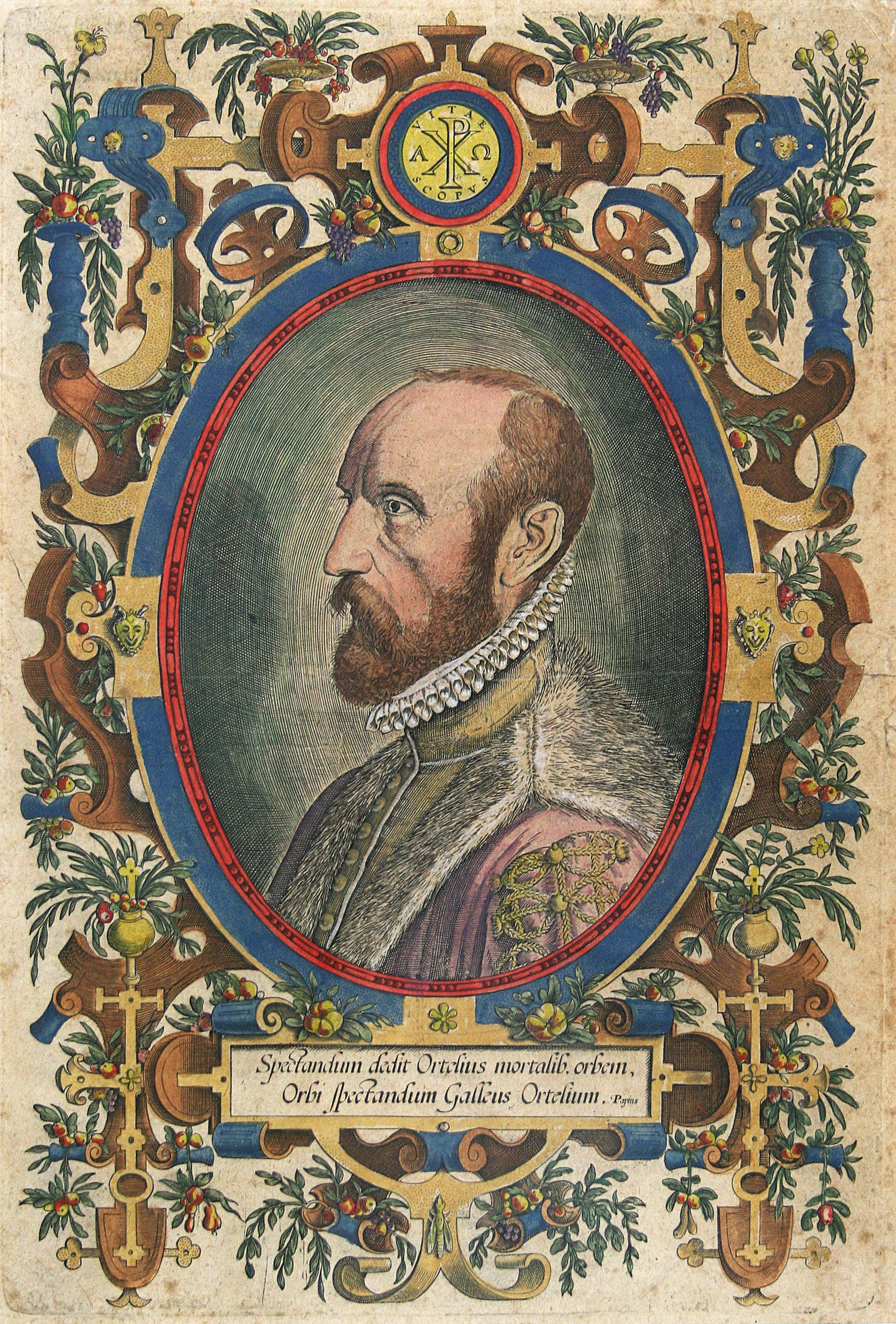
Portrait of Abraham Ortelius, from the frontispiece of his atlas, "Theatrum Orbis Terrarum", c. 1590
Portrait of Abraham Ortelius, from the frontispiece of his atlas, "Theatrum Orbis Terrarum", c. 1590
Ortelius was born in Flanders in 1527 and is regarded as one of the most important figures in the history of cartography. Through his father, he was involved in the antiquarian trade from an early age and as an adult, became part of the cartographic industry as a map engraver and illuminator. Due to his involvement in the trade, he built a formidable network of contacts throughout Europe. He was also a very active businessman, dealing extensively in maps, prints and books, both his own and from other sources. Indeed, there are records of Ortelius regularly visiting the Frankfurt Book Fair in the mid-16th century.
The first map that Ortelius produced under his own name is traced to 1564, a large world map in eight sheets known in one example, now in the library of the University of Basel. Following quickly after that, he produced a six sheet map of Spain, a two sheet map of Egypt and an eight sheet map of Asia, all in the 1560s.
However, it was in 1570 that he produced the work that is now regarded as his legacy and is often cited as one of the most important printed works ever published. The “Theatrum Orbis Terrarum” or “Theater of the World” was a bound collection of maps, all of the same size and style, curated to take the reader on a journey around the world as it was known in the late 16th century. In short, he produced the first ever “Atlas” although that term was not coined until substantially later, in 1595.
The work was an immediate success, ultimately going through more than thirty editions, from 1570 to 1612, despite the death of Ortelius himself in 1598. One of the secrets of its success was Ortelius’s use of maps by other mapmakers, usually the great learned men from the courts of Europe; hence the reason why we have maps by individuals such as Wolfgang Lazius, historian to Emperor Franz Ferdinand I of the Holy Roman Empire, Giacomo Gastaldi, one of the greatest members of the “Lafreri” School of Italian Cartography as well as Ludovico Texeira, a noted Portuguese Jesuit cartographer who provided the first European depictions of the individual islands of Japan.
During his lifetime, Ortelius was also continually revising, editing, changing, sometimes completely replacing, as well as adding individual maps to the Theatrum. Thus, the first edition of the atlas contained seventy maps and the last edition contained one hundred and sixty-seven.
Out of all the revisions to individual Ortelius maps, the most radical was performed on his map of the world. This was the first map in the book, the most likely to make an indelible impression and also the most likely to be subjected to the vast influx of geographical information which was flooding Europe during this period. Long and extraordinary voyages were providing new and exciting information about the world for the first time and Ortelius was at the forefront of both its collation and distribution.
It is the two versions of this particular map which will be the focus of our study today.
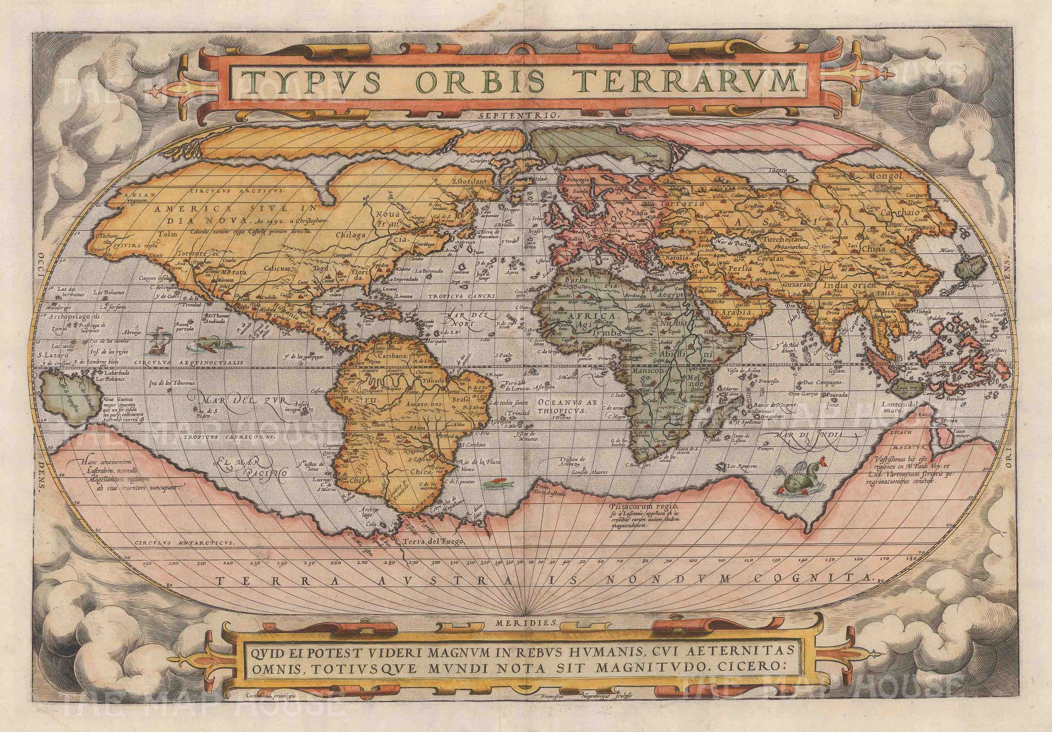
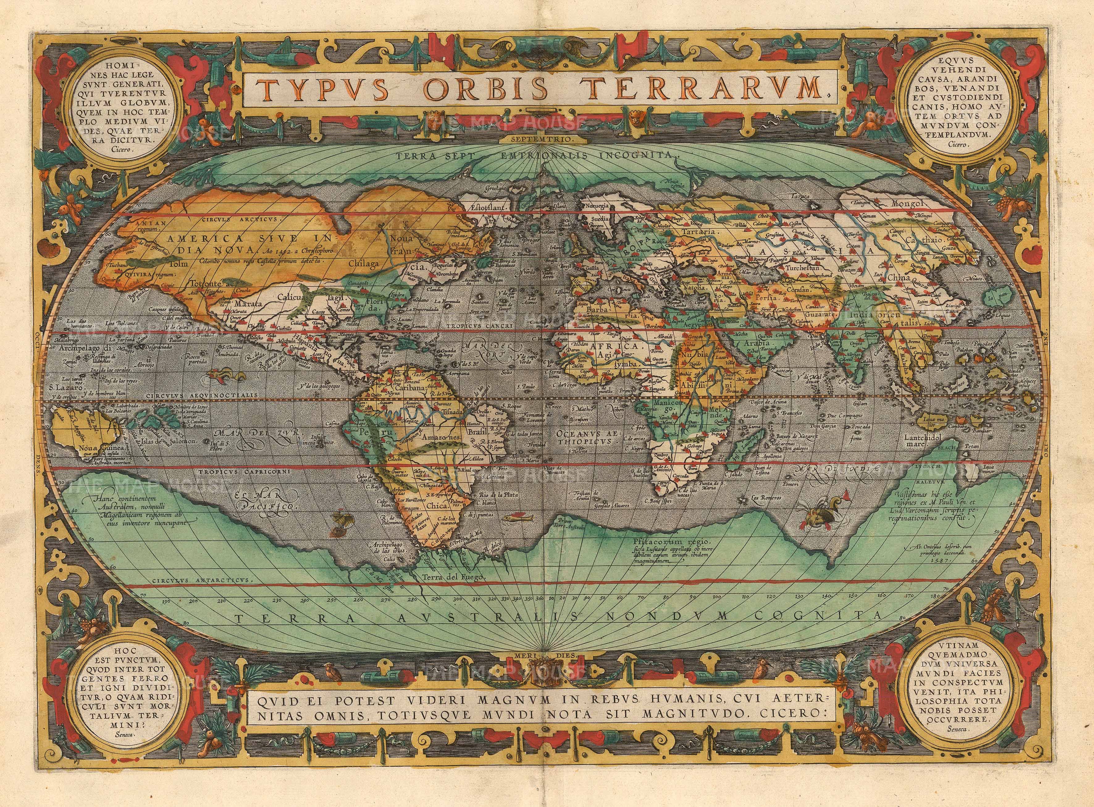
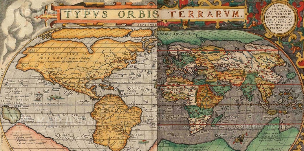
Abraham Ortelius’s Typus Orbis Terrarum. First map dated 1579 [MAP A: WLD4163], and second map dated 1592 [MAP B: WLD4185]
The illustration above shows the two printings of the map concerned. At first glance the most obvious difference is the border design of the map, but that will not be the main focus of our post on this occasion. Instead, we will be concentrating on the geographical differences.
The illustration above shows the two printings of the map concerned. At first glance the most obvious difference is the border design of the map, but that will not be the main focus of our post on this occasion. Instead, we will be concentrating on the geographical differences.
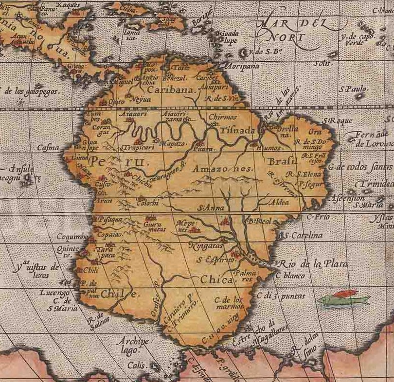
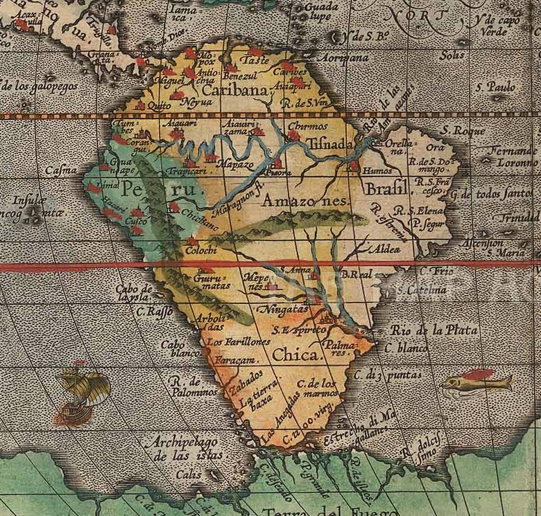
From that aspect, the immediately noticeable difference is the major revision of the shape of South America. The earlier version of the map (on the left) is known as South America with “the bulge” and was used until 1586 while the later version of the map is known as South America “without the bulge” and generally used from 1588 until 1612. Our specific examples are dated 1579 and 1592, and will be called Map A and Map B, respectively.
While the shape of South America is the first to draw the eye, there are other more subtle differences which are just as fascinating and which show just how driven Ortelius was to keep his atlas a current as he possibly could .
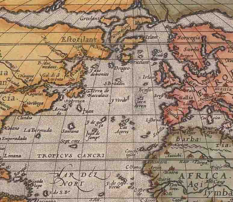
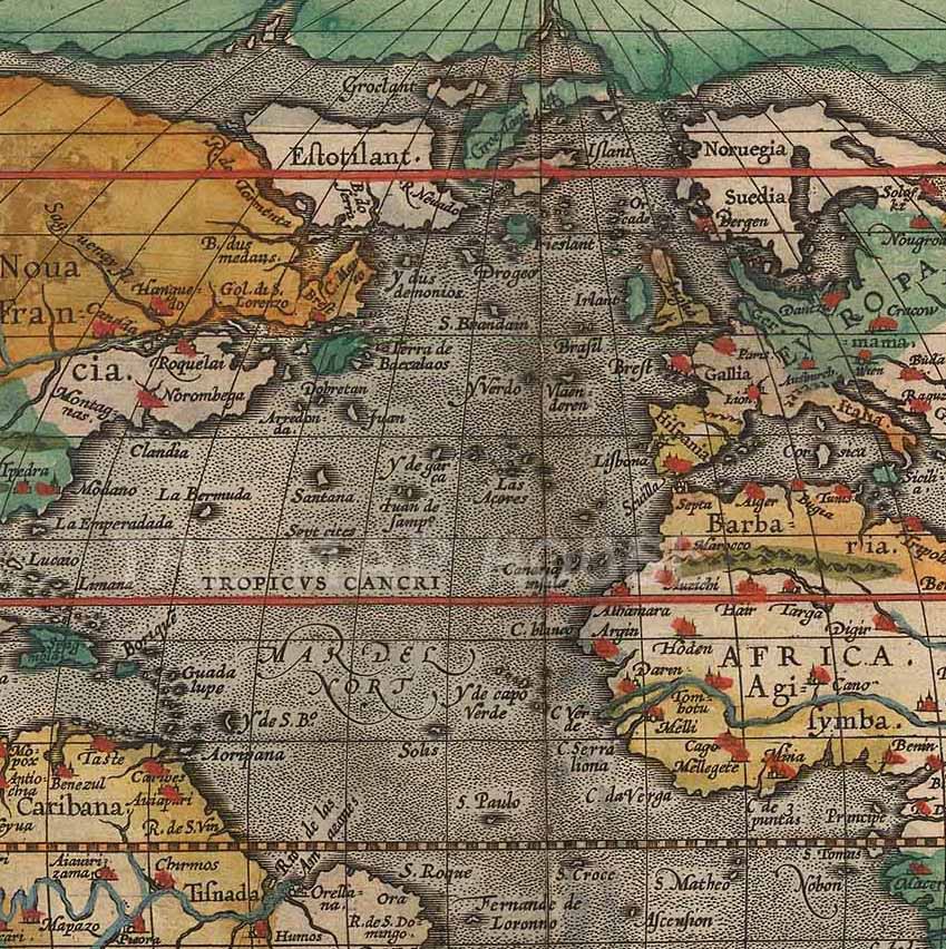
The North Atlantic region on the two maps is a haven for mythical islands, legends and misconceptions, all due to the never ending search for the Northwest Passage, in its infancy during this period. Ortelius’s main sources for this part of his map are his good friend Gerhard Mercator of Mercator’s Projection fame, the controversial voyage of the Venetian Zeno brothers and the map of Olaus Magnus, the Swedish Archbishop of Uppsala.
Both versions of the map contain the mythical islands of Friesland, Groclant, St. Brendan’s Isle and Brazil among many others. However the major difference between the two maps is the portrayal of the North Polar landmass as four separate islands as depicted on Map A. This is a reflection of Mercator’s theory that there was a continuous body of water on the North Pole, fed by the oceans of the world. In the centre of this vast Polar Sea there was a gigantic whirlpool and the Rupes Nigra, or mountain of iron, sometimes known as Mount Meru; this served to explain the existence of the Magnetic North. However, map B, the later version, now shows the North Pole as a single landmass named “Unknown Northern Land”. Interestingly, this new landmass shows four great bays where it had been previously bisected to make the separate islands.
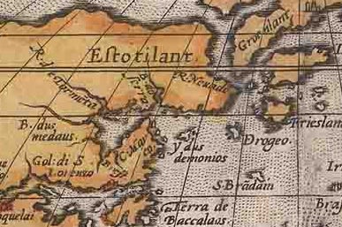
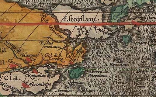
Map B also shows the region labelled Estotilant as a separate island on what is now modern Labrador. On Map A, this region is shown as part of the North American Continent. This may reflect the discovery of Frobisher Bay by Sir Martin Frobisher in 1576 or the entrance to Hudson Strait, again discovered by Frobisher in 1578.
The shape of the continent of North America is essentially the same on both maps although there are interesting differences in detail. Both show a prominent Northwest Passage, both name the continent as “America or New India” with a notation stating that it was first discovered by Christopher Columbus sailing on behalf of the King of Castille. However the western coast bears several notable differences.
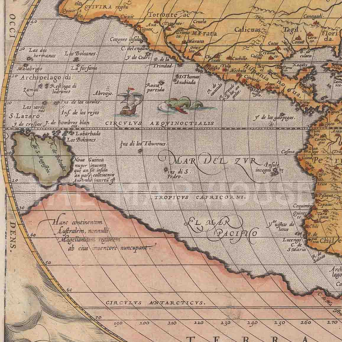
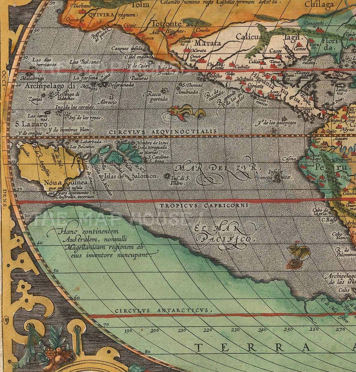
On map B, on the right, we have the inclusion of the name “Cab. Mendocino”, a very early reference to the modern Cape Mendocino. Named after the Spanish Viceroy of 1565, Antonio de Mendoza, this Cape is the first land on North American that the Spanish galleons would see after their perilous journey across the Pacific from Manila. As they followed the prevailing Easterly winds, they knew to turn South as soon as they sighted the Cape, on their way to Mexico City. The galleons made these voyages twice a year for approximately two and half centuries.
Just above Cape Mendocino is a river, “R. de los Estrechos” while further down the coast the settlement of St. Michel and the Baya de Pinaz are present. There is also a large mountain range that appears in the mythical Kingdom of Quivira. None of these details feature on the earlier Map A, on the left.
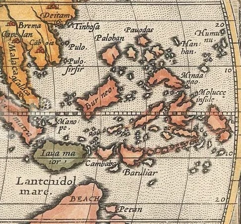
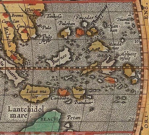
The Pacific shows one major difference, reflecting a major discovery. Map A shows the island of New Guinea, with a Latin annotation stating it is unknown if this island is in fact a part of Terra Australis or a separate landmass. Map B shows a new addition, a series of islands East of New Guinea, the Solomon Islands. This reflects reports of this new discovery made by the Spanish explorer Alvaro de Mendana in 1568. Map B also shows a new place name on the Northwestern tip of New Guinea – “Aguada”. Simultaneously the “Ins de Tiburones” slightly further East, present on Map A is no longer on Map B and the nearby ship vignette present on Map A has been erased on the later map. Curiously, and this is most noticeable on the Pacific, the hachuring on the Equator line is very different on both maps.
The Pacific shows one major difference, reflecting a major discovery. Map A shows the island of New Guinea, with a Latin annotation stating it is unknown if this island is in fact a part of Terra Australis or a separate landmass. Map B shows a new addition, a series of islands East of New Guinea, the Solomon Islands. This reflects reports of this new discovery made by the Spanish explorer Alvaro de Mendana in 1568. Map B also shows a new place name on the Northwestern tip of New Guinea – “Aguada”. Simultaneously the “Ins de Tiburones” slightly further East, present on Map A is no longer on Map B and the nearby ship vignette present on Map A has been erased on the later map. Curiously, and this is most noticeable on the Pacific, the hachuring on the Equator line is very different on both maps.
As mentioned above, the shape of South America is the most revised geographical feature from the early to the later version of this map. The geographical shape of the early version of South America is derived from Mercator’s landmark world map of 1569, the first on Mercator’s Projection. It is very difficult to discover the sources of the revised shape of the continent but it is known that Ortelius had extraordinary connections among the academics and geographers of Europe, including those from the Iberian Peninsula so logically, the most likely sources would be from there. Simultaneously, many geographical elements of the map are also reminiscent of the maps of South America by the Italian “Lafreri” School of cartographers, notably Giacomo Gastaldi’s miniature map of 1548 and Paolo Forlani’s map of 1565.
As well as the shape, there are other major differences between the two versions of the map. Map A on the left clearly and prominently shows the region of Chile as well as a large settlement bearing the same name. Map B omits both the settlement and the name. On the same vein, the nomenclature on the Western coastline of the continent has been completely changed. This is most curious since names such as Chile, Arica and Coquimbo, all present on map A and still in use today, have disappeared on Map B. The later version of the map also erases a mountain range present in southern Chile on Map A.
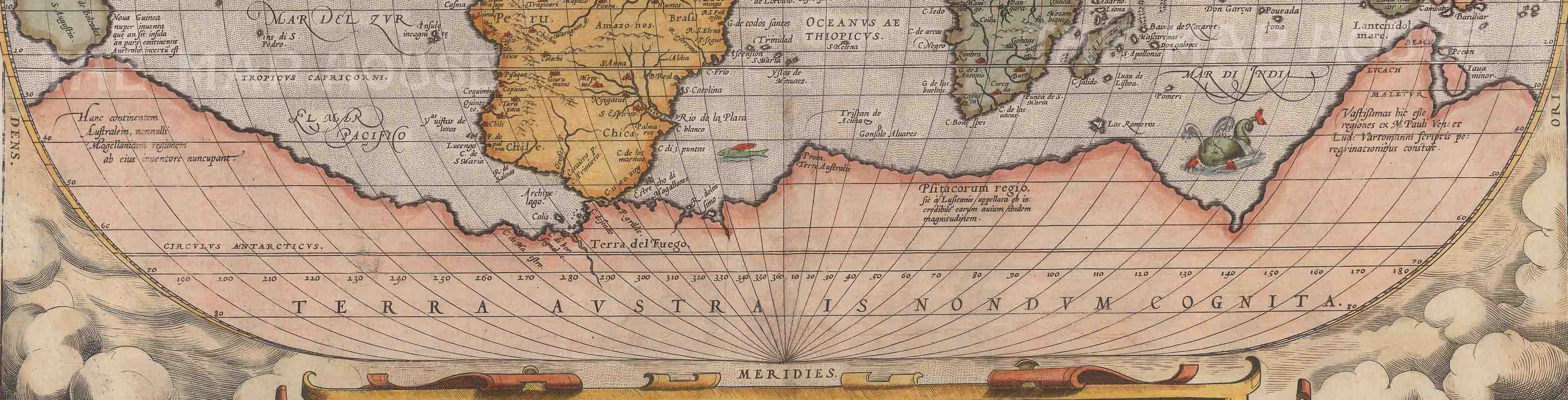
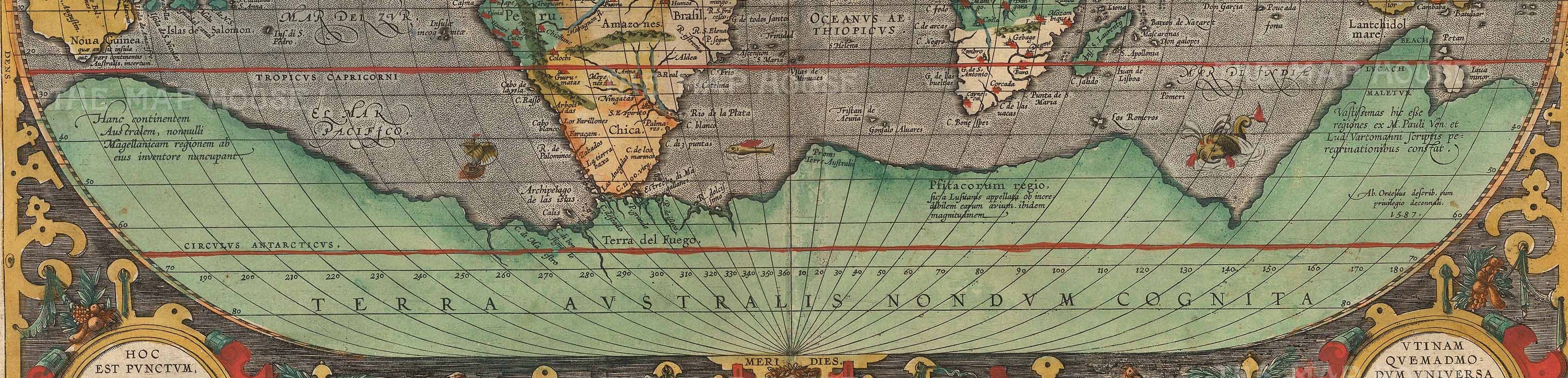
The portrayal of Tierra del Fuego and the Magellan Straits is essentially the same with the exception of the addition of one river on Map B, “P. de Isleos”. Map B also has the addition of the vignette of a small ship on the Pacific side of the Magellan Straits, possibly a reference to Magellan’s ship Victoria.
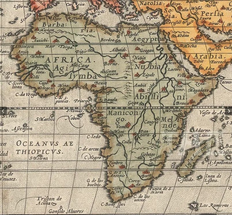
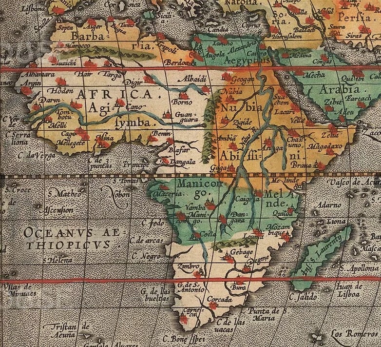
Ortelius’s sources for Africa would have been a mixture of classical geographers such as Strabo and Herodotus as well as more modern geographers, including the most famous description of Africa of the 16th century, the ”Della Descrittione de ll’Africa,” by Leo Africanus. Ortelius himself acknowledges the cartographers Gastaldi and Ramusio as the main sources for his map although it was his decision to reduce the East to West distance of the continent in comparison to the two mapmakers above. Possibly due to the immediacy of the Italian maps, the portrayals of Africa are essentially the same on both maps A and B.
As has been mentioned above, the sources for the individual countries in the continent of Europe are varied and numerous while his main cartographic documents available to Ortelius would again be from the Italian School. Again, the shape and details of Europe are essentially the same on both maps.
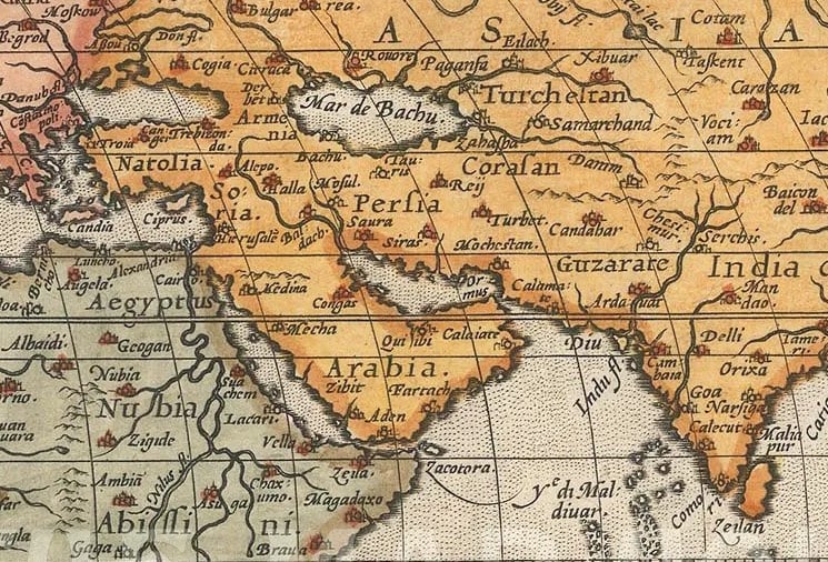
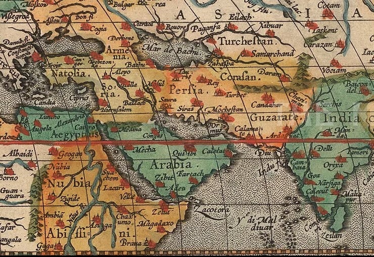
For the Near, Middle and Far East, Ortelius would have had access to accounts of Dutch, Spanish and Portuguese voyages but from a geographical perspective, his main source would have been Giacomo Gastaldi’s majestic four sheet map of the region first produced in 1561.
Again, the portrayal of the region between the two different printings of the world map is essentially the same with the exception of one major change. On map B, the name “Philippinas” has been added to name that group of islands; again, this name was present on the Gastaldi map and most likely to have incorporated from there although it is curious that it was not present on the earlier map A.
Finally, on the South Eastern corner on the map, on the tip of the region called “Beach” of the Great Southern Unknown Land, “Terra Australis nondum Cognita” another major change occurs: a panel of text is present on both maps states that much of the information on the vast land of Asia was provided by “M. Pauli Ven” (Marco Polo of Venice) and “Lud. Vartomanni” (Ludovico Verthemannus a.k.a. Ludovico di Varthema) an extraordinary Italian traveller, who among many other accomplishments, was the first recorded European to enter Mecca as a pilgrim, in the very early 16th century. However, on map B, Ortelius’s signature and an engraving date of 1587 is added, the first time that Ortelius actually claims authorship of one of his world maps.
Ultimately Ortelius’s maps are important for a multitude of reasons but one of the most compelling is this drive to continually portray the latest geographical information and this map of the world is the best illustration of this extraordinary willingness to innovate.