
J.C. Betts
Underground Railways of London, 1924
13 x 17 ½ in
33 x 44 cm
33 x 44 cm
LDN6957
This unique Tube map design was created by the artist J.C. Betts in 1924 and was issued in 4 editions between June 1924 and Summer 1925, coinciding with the British...
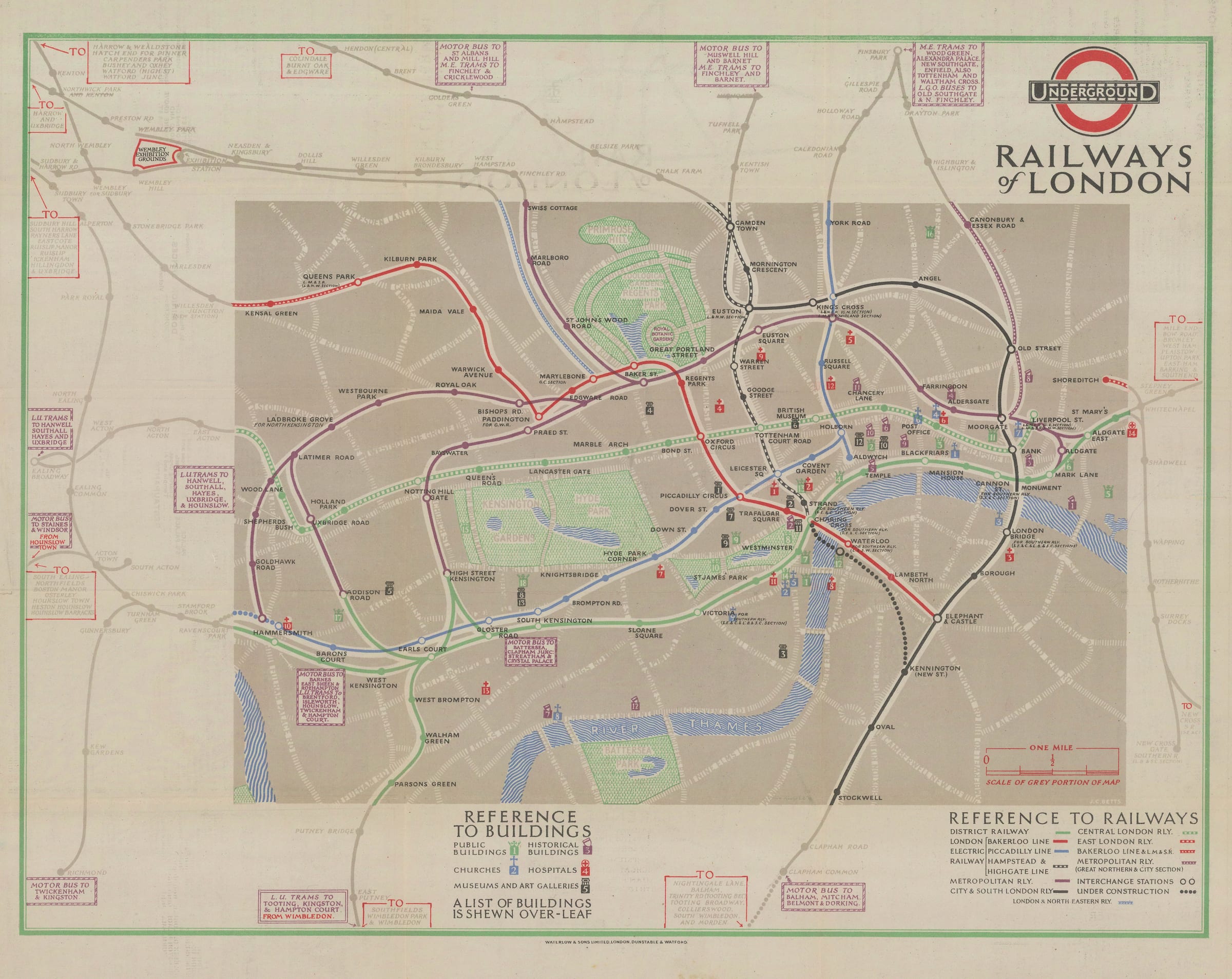
This unique Tube map design was created by the artist J.C. Betts in 1924 and was issued in 4 editions between June 1924 and Summer 1925, coinciding with the British Empire Exhibition. The Wembley Exhibition Grounds are marked in red in the northwest corner of the map.
Betts’s map is a major departure from Macdonald Gill’s maps of 1920-23, placing much more emphasis on Central London and reducing many outer London stations to names in text boxes along the edges of the map. Within the Central London area, some background street details have been added back onto the map, along with parks and the river. Gill had completely erased all background detail from his maps to focus exclusively on the railway lines, pre-empting in some ways Harry Beck’s revolutionary design of 1933. It was likely felt at the time that this map’s intended audience (non-London-residents visiting the British Empire Exhibition) might value some background context. The choice to mark museums, galleries, landmarks, and historical buildings on the map and to index them on the verso further supports the idea that this was by and large a tourist map.
Curiously, Betts has chosen to use a series of completely unique fonts, icons, and colours on his map – only the London Underground roundel logo establishes a consistency of design between this map, its predecessors, and the maps that followed. Macdonald Gill had also used a distinct font family on his 1920-23 maps, even though the now-iconic Johnston Sans font had been created in 1917 and was already in use on signage across the Underground network. Betts has opted for a style which falls somewhere in between the Johnston and Gill fonts. Stations within the Central London area are named in a sans serif upper case font which resembles, but is not exactly, Johnston Sans. Station names outside of Central London revert to a serif font more reminiscent of Gill’s lettering, as does the map’s ‘Railways of London’ title.
Betts also produced an attractive black-and-white map of the British Empire Exhibition grounds in 1925, but he was never commissioned to produce another Underground map. This appears to have been standard protocol during the early 1920s with many different artists offered map commissions. E.G. Perman’s 1928 map (see below) is another example of an excellent map which only appeared for one year.
The trifold pocket map became the standard Underground map format with the arrival of Fred Stingemore’s design in 1925. Larger maps were still occasionally published after 1925, but they tended to coincide with major events like the Festival of Britain or a royal coronation. For everyday users of the Tube, the portability of the pocket map could not be beaten.
Printed colour. [LDN6957]