
London Underground
Map of the Electric Railways of London, 1919
10 ½ x 13 ½ in
27 x 34 cm
27 x 34 cm
LDN6999
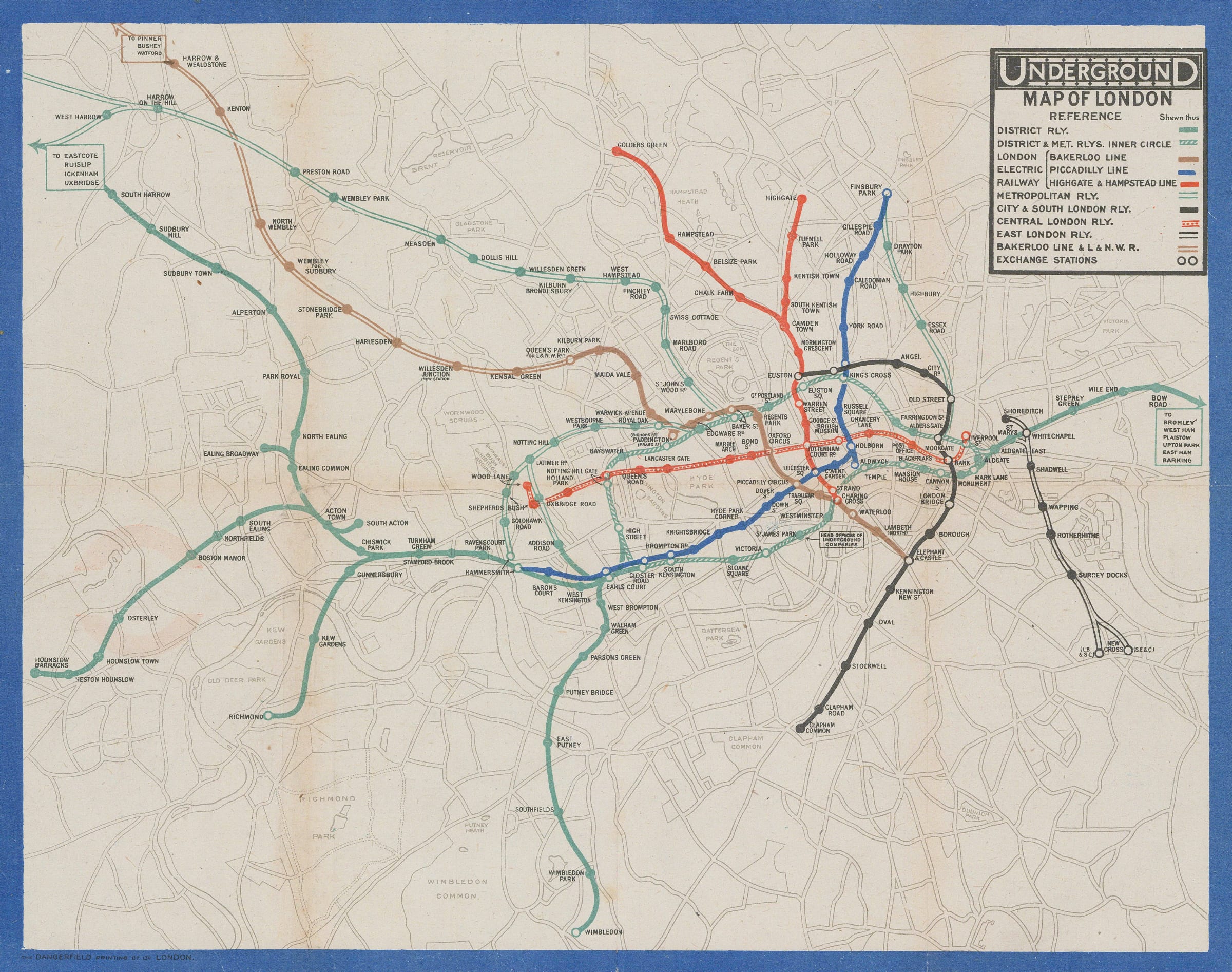
This is the first Underground map issued to passengers after the end of the First World War in 1918. Some restrictions on colour printing must still have been in place...
This is the first Underground map issued to passengers after the end of the First World War in 1918. Some restrictions on colour printing must still have been in place as a limited palette of five colours (red, brown, black, turquoise, and blue) is used to show nine different lines. The use of turquoise to show the rival Metropolitan Railway and District Railway is a particularly amusing choice, though this may also have been an effort to minimize competition from the Metropolitan Railway. Some background detail is provided on the map, but it is printed entirely in grey. Unlike the 1916 wartime edition of the map, not even the river or the parks are coloured.
The ‘UndergrounD’ logo appears on the front of the map in its usual place in the upper-right corner, but the back of the map is where this map’s most important feature resides. When folded, this map’s cover features the first use of the now-familiar Johnston roundel with the red circle and black bar. Red circles had been in use on station name signs since 1908 and the first use of the red circle with the UndergrounD logo over the top appeared in a 1912 poster by Charles Sharland celebrating the solar eclipse of that year. Hoping to establish a more consistent brand identity, Frank Pick (London Underground’s Publicity Officer) had asked Edward Johnston to standardize the red circle and black bar design in 1917. With Pick’s support, Johnston’s standardized roundel quickly became an essential feature on Underground maps from 1919 onwards and is now an iconic part of London’s identity.
Printed colour. [LDN6999]