
W.J. Adams & Sons
65 x 106 cm
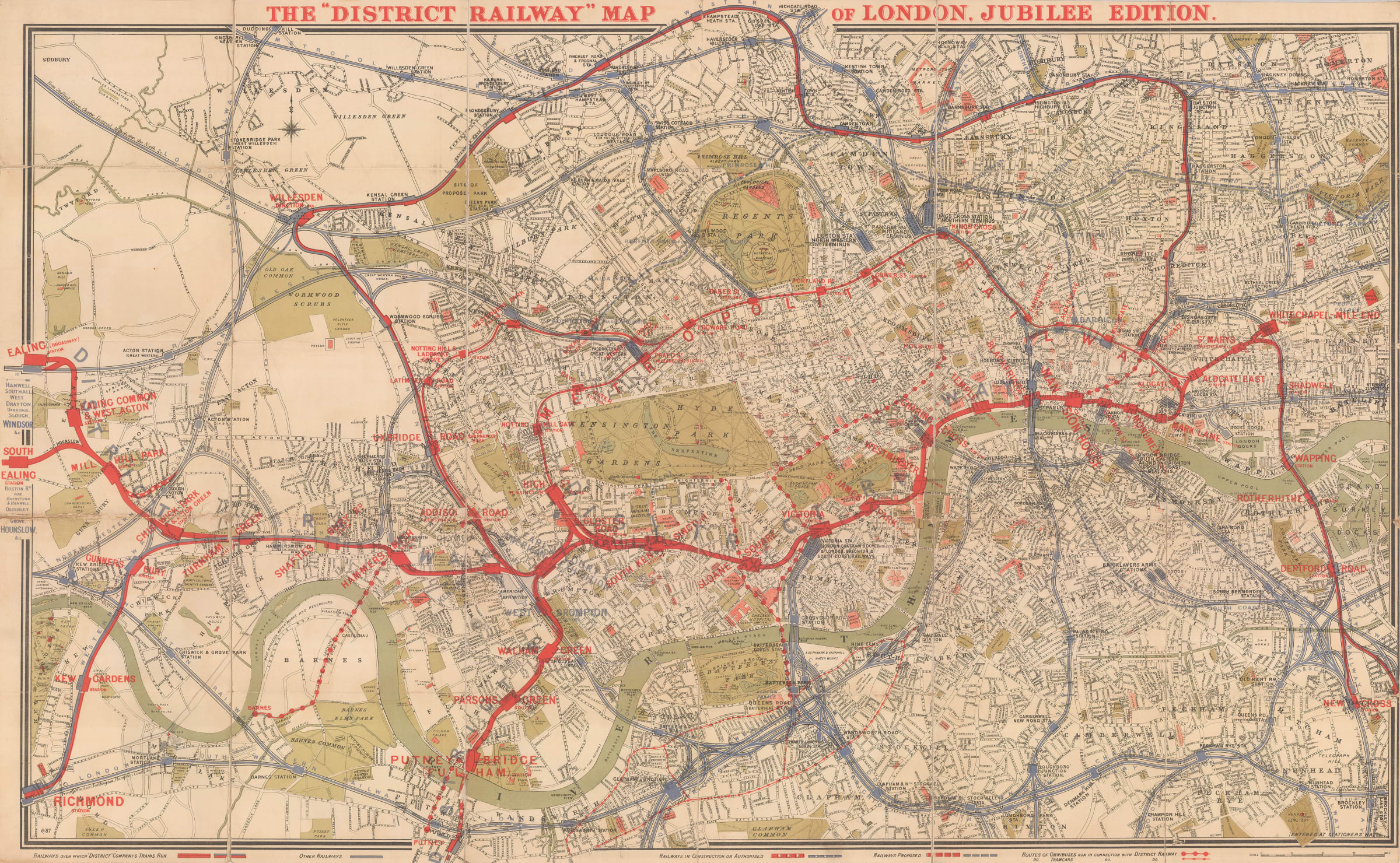
Starting in 1874, the District Line began issuing maps under its own branding for the first time. These pamphlet maps were still almost a meter wide when fully unfolded, but improved colour printing and increased emphasis on the Underground lines make these maps far more readable than any of their predecessors. This example is the commemorative 'Jubilee Edition' of 1887, celebrating Queen Victoria's 50th year on the throne. The cover is especially decorative.
These maps employed thick red lines to show the Metropolitan and District Railway routes, whilst other railways are marked in black (until 1879) or blue (1880 onwards). District Railway station names are printed in large red letters. The underlying base map is also simplified, with roads left uncoloured and parks shaded in a light green. The covers of these folding maps were also handsomely illustrated with images of London landmarks, or in the case of this 1887 ‘Jubilee Edition’ with images of the far corners of the British Empire.
Not only did these attractive maps allow customers to navigate the District Railway system more easily, but they also helped to establish some of the design elements which would become ubiquitous across the early Underground, such as fonts and signage styles. At least 10 editions of this map were published between 1874 and 1906, including an expanded edition in 1902 showing Greater London and its environs to show the westward extension of the District Railway to Hounslow and Uxbridge.
Printed colour. Folded. [LDN6956]